As AI models grow more complex, with capabilities ranging from natural language generation to multimodal reasoning, the real challenge isn’t what the models can do. It’s how we present those capabilities to people!

At the intersection of machine intelligence and human behavior lies interface design. The way someone feels when they interact with an AI system - curious, confident, in control - depends entirely on how we shape the experience. And too often, the interface is either overcomplicated or overly abstract.
Here's how we solved that:
1. Hide the complexity, reveal the value
AI models are built on layers of abstraction - parameters, vectors, embeddings, logits. But people don’t think in models. They think in goals.
That’s why we’ve moved toward goal-oriented UI design. Instead of exposing users to technical terminology or overwhelming customization, we start by asking a simple question:
“What are you trying to do?”
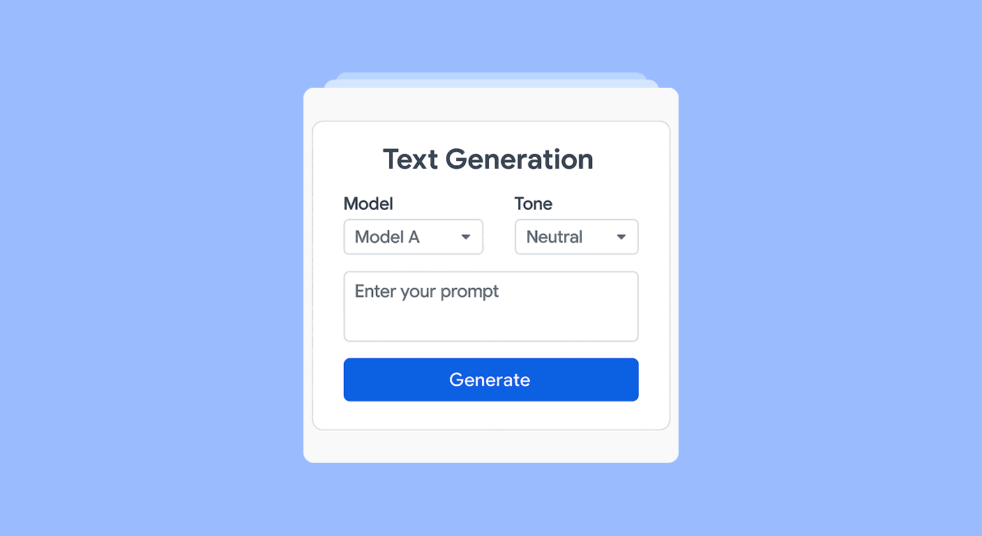
From there, we design around intent. For instance, an interface that helps a marketer generate campaign copy doesn’t need a model picker or temperature slider. It needs an input box, a tone selector, and a clear preview.
Powerful AI under the hood. Simple, focused UI on the surface.
2. Embrace progressive disclosure
Great interfaces don’t oversimplify - they unfold as you need them.
Advanced users still want control. So we bake in deeper options using a progressive disclosure model. This means that the interface stays clean and focused by default, but expands contextually based on user actions.
Take a product like AI-powered document summarization. At first glance, it might show just a “Summarize” button. But once you use it, new controls appear: summary length, focus area, tone adjustments.
The trick is to scale complexity with confidence - giving beginners a way in, and experts a path forward.
3. Feedback isn’t a feature - it’s a foundation
AI isn’t always right. That’s a fact we design around, not ignore.
Every interface we build includes tight feedback loops. If the AI misses the mark, the user can refine or correct it instantly. We use patterns like:
Inline editing
Regenerate with context
“Why did I get this result?” tooltips
This keeps trust high, and gives users a sense of control without needing to understand how the model works.
We also leverage user corrections as implicit signals to fine-tune the interface and improve the model over time.

4. Speak human, not machine
AI systems are trained on code and corpus - but users speak everyday language. The interface has to bridge that gap.
We designed every prompt, label, and tooltip using human-first language. If it sounds like it was written by an engineer, we rewrite it. If it makes the user feel like they’re wrong, we rethink it.
For example:
Instead of “Model failed to infer entity,” we say “Hmm, we couldn’t find what you were looking for.”
Instead of “Invalid input,” we say “Try describing that a bit differently to make me understand.”
It’s not about dumbing things down. It’s about meeting people where they are.
5. Design with transparency, not mystery
Users don’t need to know how the AI works - but they do need to know why it did what it did.
So we focus on designing for explainability. That might look like:
A “See why” link next to a recommendation
A traceable path showing how an answer was derived
Visual cues that highlight model confidence or ambiguity
Well, I'm of the opinion that when people understand why something happened, they’re more likely to trust it - and to keep engaging.

Final Thoughts: Simplicity is sophistication
Designing for AI isn’t just about UI controls - it’s about building experiences where the technology feels invisible and the user’s goal takes center stage.
That’s what I love about this work.
The real measure of success isn’t how impressive the AI is. It’s whether someone, with no background in machine learning, can use it - and smile.
In the end, the best interface is the one that feels obvious. Even if it took a thousand iterations to get there.